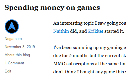
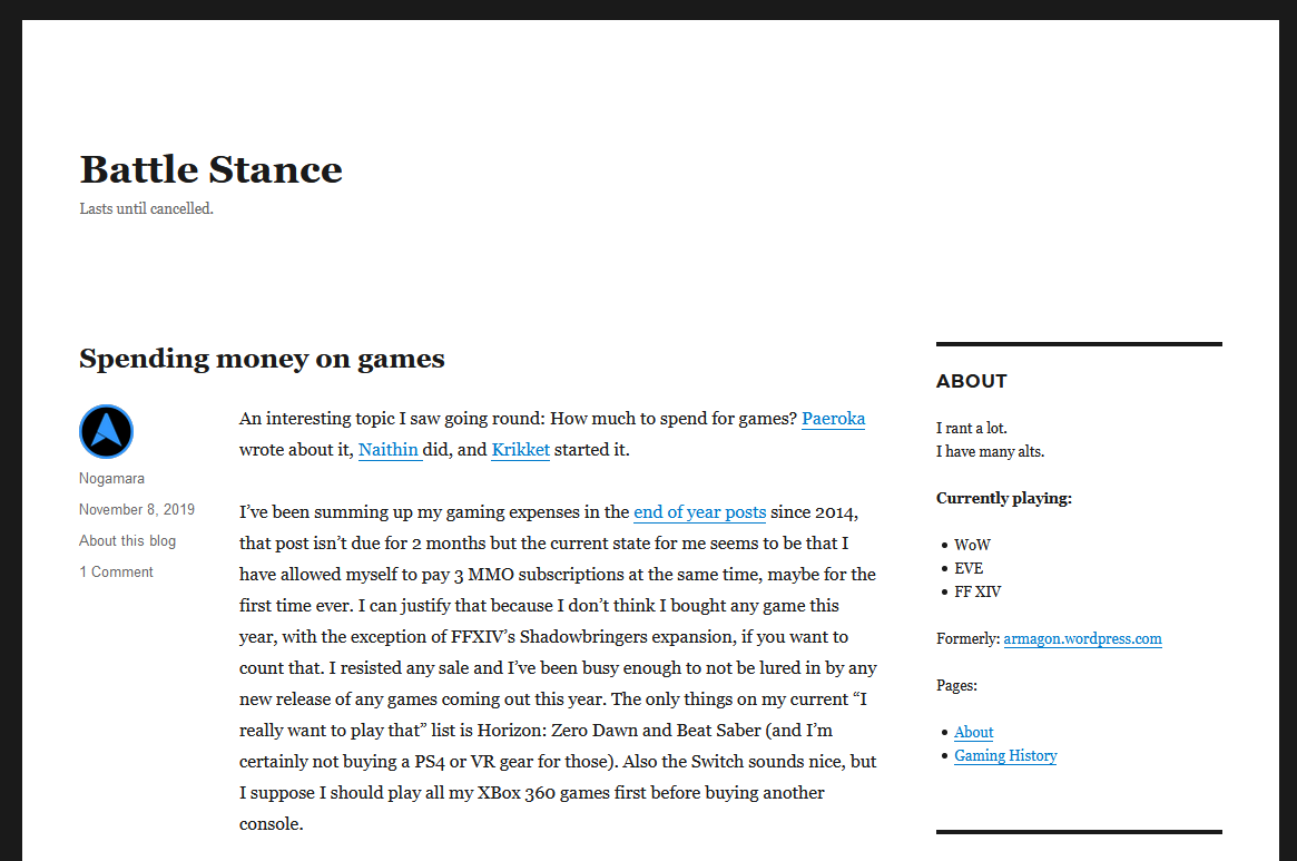
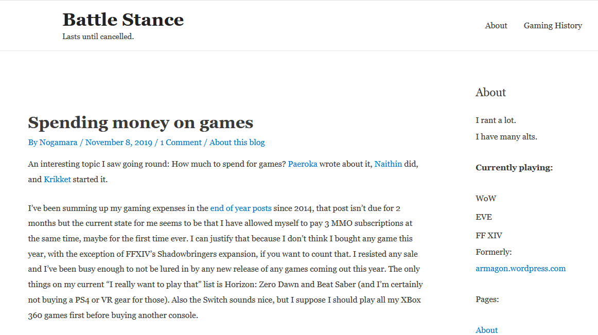
When I moved this blog off wordpress.com 8 months ago I was only 90% happy with my new theme, trying very hard to preserve the old basic look I’ve had since 2009. My CSS skills are a bit rusty and I really wasn’t in the mood to fiddle with everything endlessly, but I was getting less and less happy with something I couldn’t express 100%.

Inspired by Rakuno’s post I instantly noticed what was bugging me most, the author blurb/posted on/meta part.

So as I had a little time I went digging for a theme where I could do this better after spending half an hour fiddling with the CSS on the old theme and overwriting 20 rules. It was close, but not perfect and then I noticed 2-3 other things..

Long story short, now I have a new theme, Astra, and I only had to override one thing with CSS and the rest can be configured. Awesome. Let’s see if I stay happy with this evolution of the basic look.


- Kinda missing the dark border
- not yet 100% sure how to align the site title
- Maybe get rid of that space before the first post
But overall I think I’m happier.